Glashütte Original Sixties Annual Edition 39mm – The Temptation of the Green Dial
A dazzling, desirable addition to the Sixties collection, with a stunning green dégradé dial.
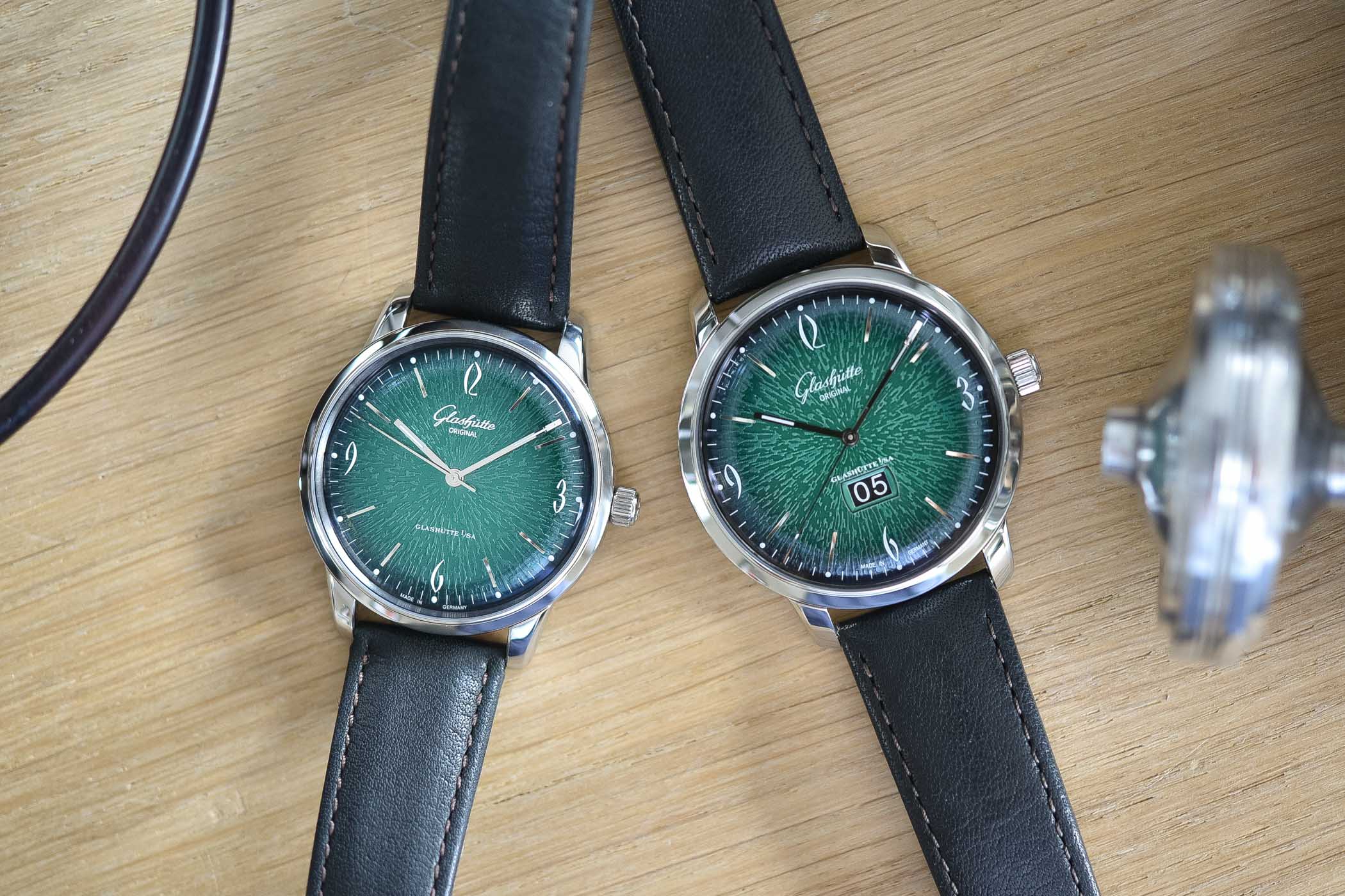
Just like any other luxury industry, the watchmaking world is driven by trends. After a massive invasion of blue dials – a predominant trend over the last five years – brands are now trying to find new directions. One of them, slowly inching its way into the limelight, is the colour green. And if blue was already a difficult colour, which could easily result in a plain, boring watch, green is even more complex to master. Few have succeeded but one truly great example has been presented by Glashütte Original, with the Sixties 2018 Annual Editions. Comprising two models, including one with a larger case and a Panorama Date, it is the simplest of the two that caught my eye. Let’s look at it in detail.
Green isn’t the first colour you might think of when it comes to watches. Of course, this colour is a sort of must-have in Arabic countries, however, the rest of the world might see it as slightly too original at first. Silver, white and black are the obvious choices when it comes to luxury watches, followed by blue for a few years now. In addition to that, “green” doesn’t mean anything in itself, as there are hundreds of different greens – light, dark, bright, vivid, blueish, yellowish, brownish, shiny, matte, pale, forest green, khaki green, olive green, pine green, British racing green, mint green, acid green… Well, you get the picture. Such a complex colour might explain why there’s not yet a true invasion of green dials in display windows.
Some (few) brands have, however, found the right recipe: Rolex (simply because it’s the brand’s emblematic colour), H. Moser (with its fumé dials), and Laurent Ferrier are good examples. The latest one to enter the green-game is Glashütte Original. Surprising? Not really. For a few years now, the brand has undergone a deep restructuring of its collections and has released several watches with much bolder designs. Certainly, the silvery-white dials with Roman numerals are the essence of the German manufacturer, but they are flanked by collections with younger designs and vivid colours – see for instance the Sixties Iconic Square collection or the recent Senator Chronograph “The Capital Editionâ€.
While introducing bright, colourful dials into the Senator collection wouldn’t make sense, there’s one range of watches at Glashütte Original that perfectly fits the concept: the Sixties. As we showed you in this article, comparing the modern and the vintage versions, the Sixties is a faithful revival of one of the brand’s iconic watches. Produced in various iterations, it was originally available with coloured dials. The new one, with its subtle vintage design, takes on board some slightly bolder and more colourful styles – see the 2015 Iconic collection.
A dial, first and foremost
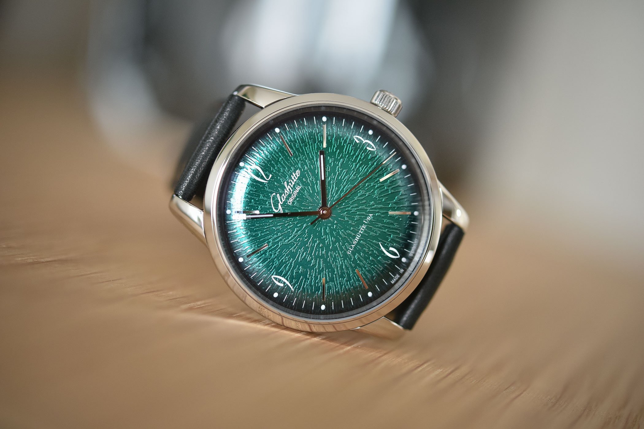
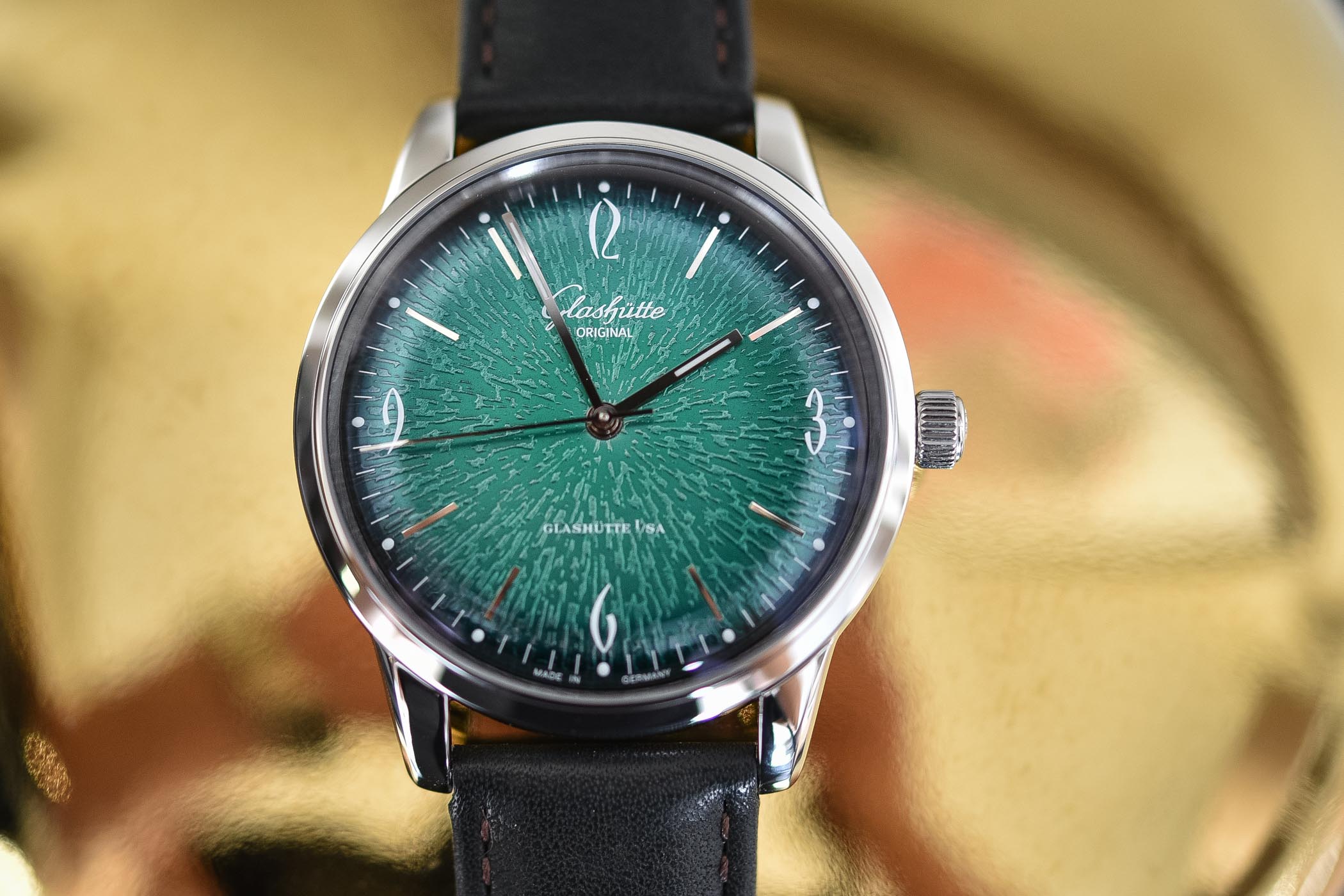
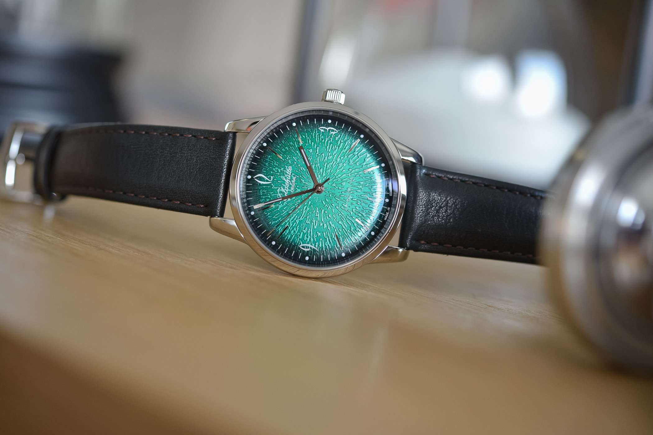
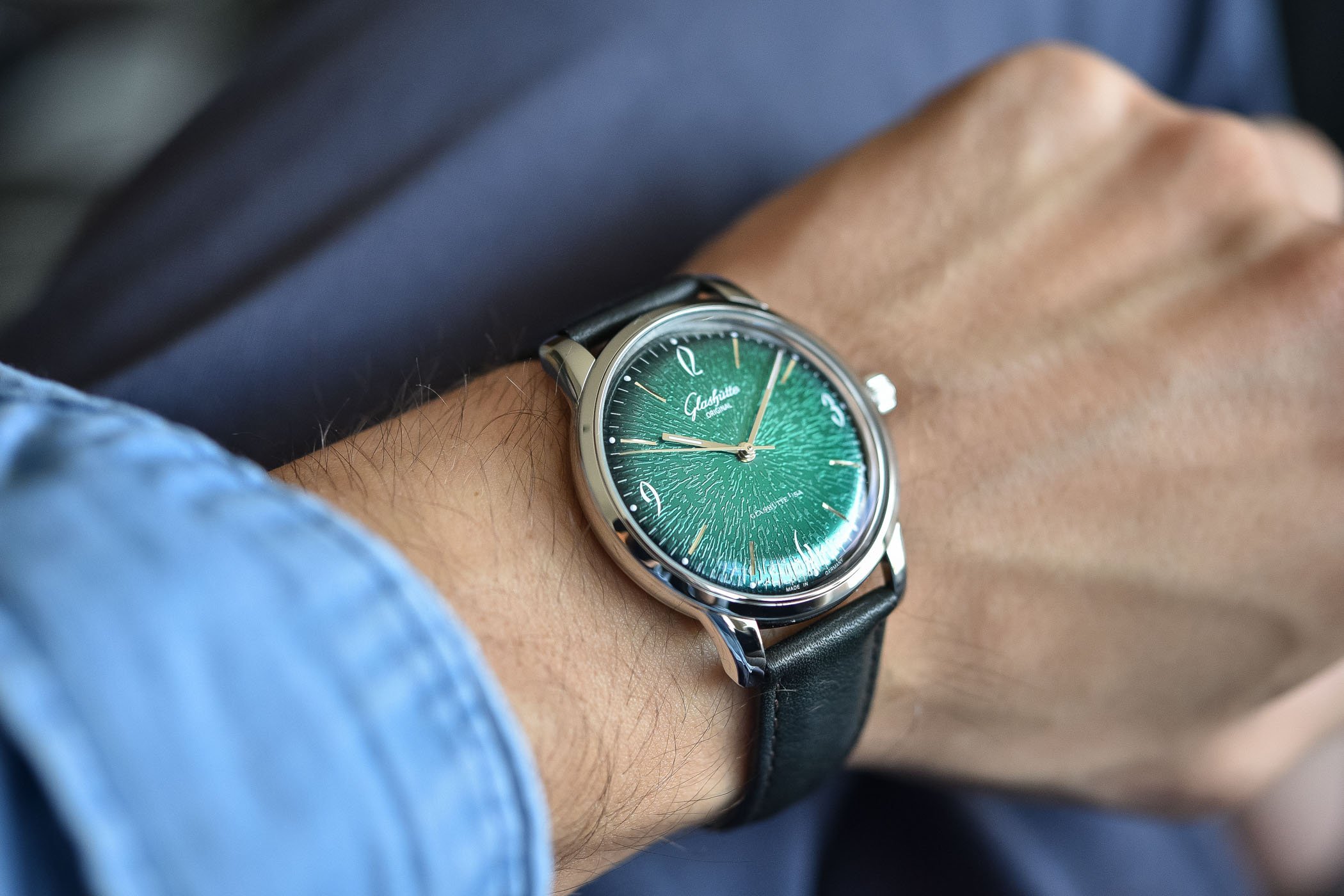
Without changing the basics about the time-only GO Sixties, the brand introduces a new, very-green version with a dial that is, in all fairness, certainly the most striking ever done by the brand. Not only has it got colour, but it also has shine and texture. The choice made by Glashütte Original for this Sixties Annual Edition is a metallic green colour, which feels more like a green-coated metal plate than a traditionally painted dial. The colour changes from deep forest green to bright mint when the light hits the dial. Lively, fascinating, surprising, unusual…
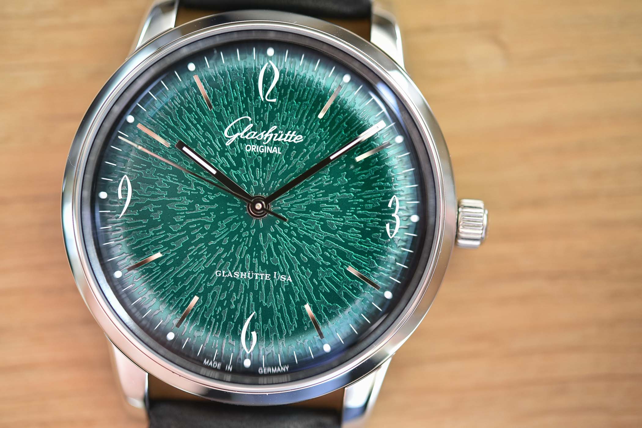
The colour isn’t the only “trick” used by the dial to stand out from the crowd. It also features a so-called dégradé colour, which means the colour transitions from a lighter tone in the centre to a darker tone on the domed periphery of the dial. In a final step, black lacquer is applied using a special spray gun, which produces – depending on the angle at which the gun is held – an individual colour gradient that renders each dial unique. The lacquered dials are then fired at high temperature to fix the colour.


Apart from the colour and the gradient styling, Glashütte Original also adds a specific texture to this dial. As we mentioned, GO manufactures its dials in-house, in a manufacture based in Pforzheim, Germany. There, designers have the ability to create and test, thanks to several “dies” held in the archives. The texture of this dial, which I hardly can put a name to (if you have an idea, feel free to comment) is produced by the use of original tools and methods. With the help of a 60-tonne press, the dial blank is imprinted with the intricate pattern of a stamp.
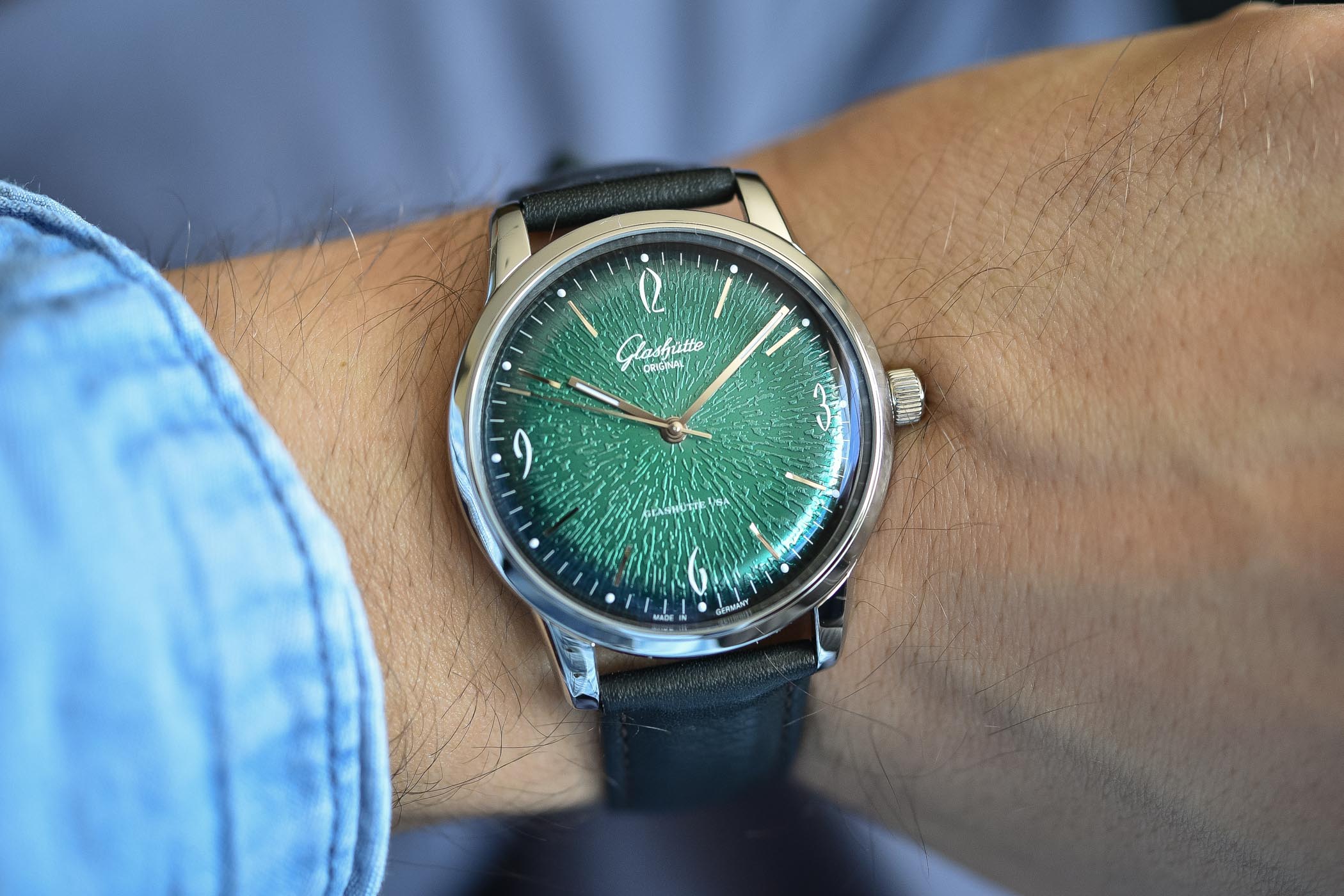
The rest of the dial is identical to other Sixties watches: iconic and historically relevant stylised Arabic numerals, dots every hour, applied metallic baton indices. The hands are simple batons too, with a thin line of luminous material. In the flesh, this dial matches the slightly vintage feel of this collection perfectly and appears original and lively. Of course, the texture and the colour are less present with the watch on your wrist than on our macro photos. We intentionally forced the reflections to let all possible shades appear. However, in normal conditions, the Glashütte Original Sixties Green Annual Edition remains an elegant watch with a twist.
The rest is familiar… and pleasant
For the rest, no drastic changes to the Sixties time-only. As mentioned, Glashütte Original has introduced two watches this year with this same green dial. The second, as shown below, is larger (42mm diameter) and has a different movement with a Panorama Date complication. The reason why I specifically chose to review the smaller, simpler version is entirely personal. Both are equally nice. However, I have a small wrist and a tendency to wear smaller watches. The 3-hand version was naturally my favourite.
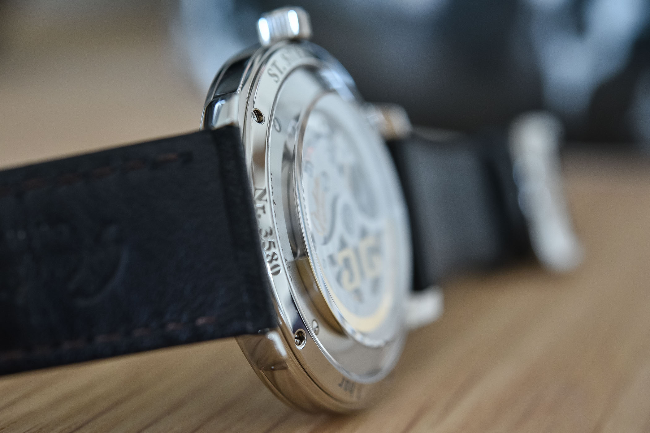
The case of the Sixties looks very simple… at first. It is, in fact, more complex than meets the eye and employs several visual tricks to make it look thinner than it really is. Not per se a thick watch – with its 9.4mm thickness – the Glashütte Original Sixties sits like a slimmer 7mm-thick watch on the wrist. A large part of its thickness is due to the domed sapphire crystal on the front as well as the one on the caseback. Most of the thickness of the movement is contained inside the curved surface of the caseback, meaning that the flanks of the watch are extremely thin – and as they are the only thing you see when wearing the watch, the Sixties appears as an ultra-thin piece. Clever, isn’t it?
The case is polished steel, with short, curved lugs. Once strapped on the wrist, it is definitely on the restrained side. However, this is a positive aspect for me, as it goes in line with the vintage spirit of this collection. Securing the watch on the wrist is a simple calf leather strap. While I can understand that GO wanted the focus to be on the dial, I would have prefered a slightly bolder strap – but then again, we must understand that we buy a watch, not a strap. This, as well as the overall average legibility in certain conditions – due to the lack of contrast of the hands – are the only real flaws I could see in this watch.
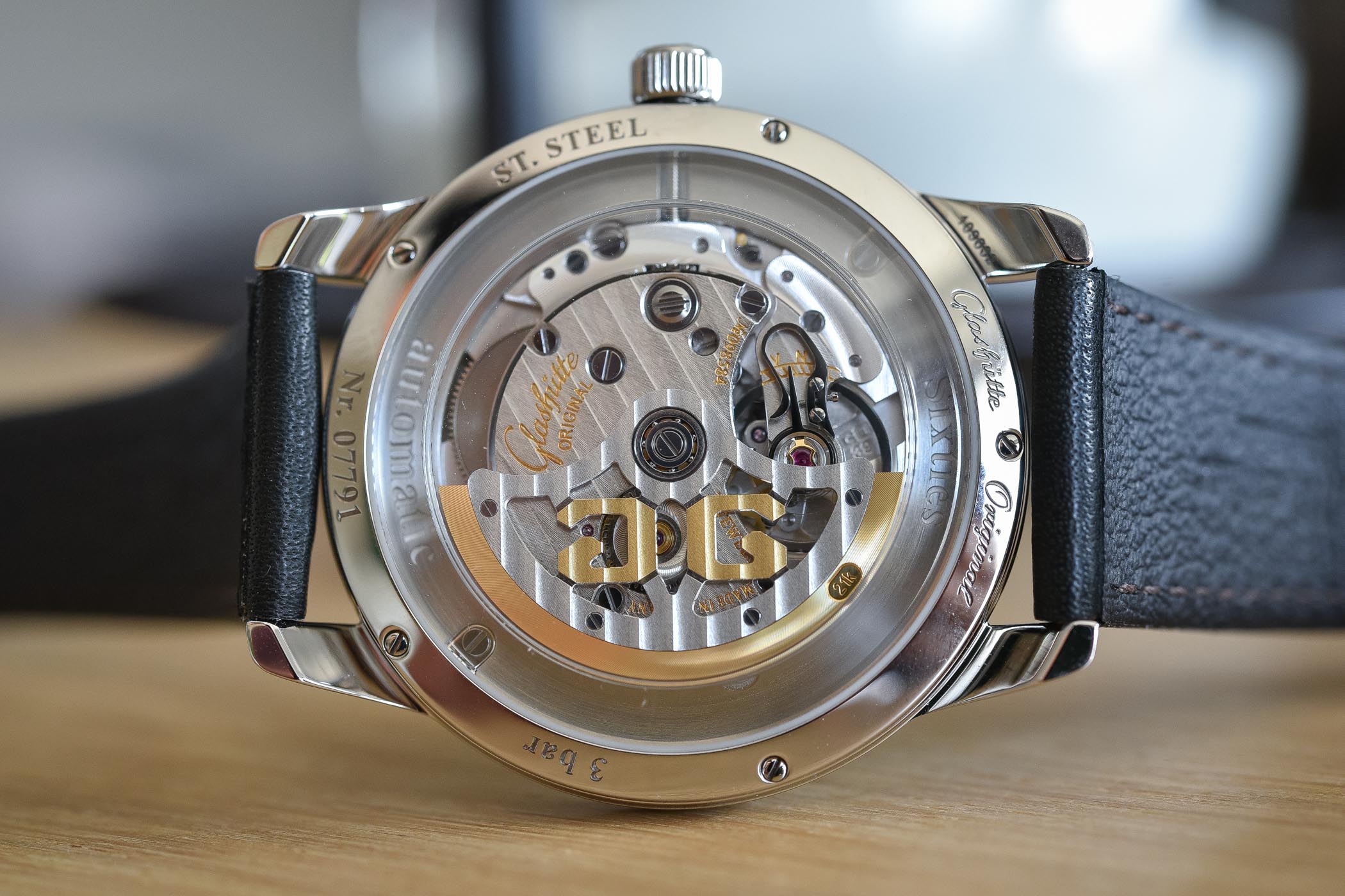
Visible through the ‘box’ sapphire crystal is the in-house calibre 39-52 – this means that you can observe the movement from various angles. This 3-hand engine is a classic for the brand, with its 4hz frequency and 40-hour power reserve. If the specifications are quite “standard”, the decoration is very pleasant with Glashütte ribbing (the German equivalent of Côte de Genève) on the three-quarter plate, balance cock and skeletonised rotor. The latter features a 21k gold oscillator weight, for improved inertia, and is adorned with the Glashütte Original double-G logo.
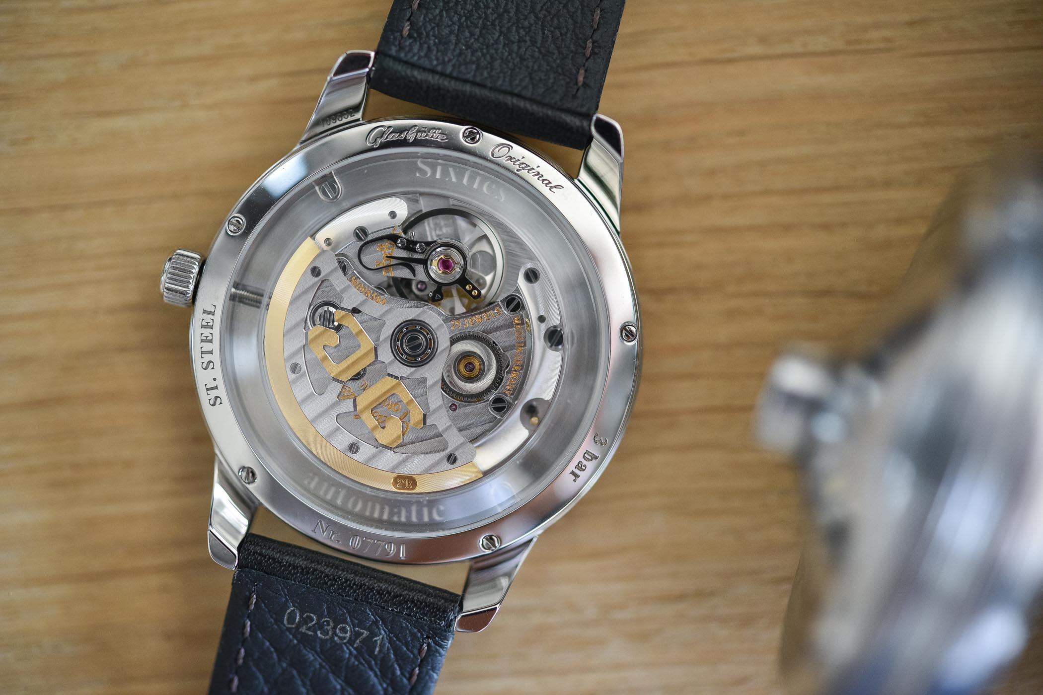
The swan-neck fine adjustment is also nicely finished with bevelled edges and polished steel parts. The movement is held in place by a movement holder (a metal ring around the movement), which due to the specific ‘box’ sapphire is clearly visible. This feels surprising at first but in fact, it gives the watch some more originality – and objectively, it would not have worked very well with a larger movement.
Altogether, the Glashütte Original Sixties Annual Edition 39mm is a lovely watch – not a word I often use, but in this context, this is the best word I can think of. It dares to flaunt a different colour and style and it feels unique. It is one of the few watches where green has been perfectly dosed, without losing the usual elegance of the brand. A definite contender for our Top 5 green dials. Price: EUR 6,300. More details on www.glashuette-original.com.
6 responses
Personally, I hate it : it is pure melodrama in much the same way as the fume dials of Moser. Still, it takes all sorts.
Not my cup of tea, but I do like Glashutte’s watches in general. Wish they’d make a Seventies Annual Calendar.
This leaves me uninspired, due largely to the texture effect, which reminds me of “spin art”. Yes, green is challenging, but this watch feels more novelty than substance. I also don’t like the back, which is for me seems aesthetically unrelated to the front.
Take a classic, restrained, vintage dress watch…and ruin it.
Think again GO
I guess the only people who wanted to comment were the ones who didn’t like it. I am pleased to say that I own the date version. It is one of the most spectacular things I have ever seen. I wish I could share pictures here because there are so many levels of texture and color. It is a bold dial. I wear mine on a tattooed arm with greens and blues. It worlds tremendously. To each one’s own, but, for me I want my watch to have some special characteristic. This certainly has that.
As much as I like the green dial (and this years orange dial), I disagree that the ring around the movement ” gives the watch some more originality “.
It just looks like the movement is too small for the case.