Patek Philippe Nautilus ref.5980/1A Fully Reviewed

Any discerning watch fan would know that the race to build the first ever automatic chronograph in the late 1960s was one of the moments that changed the landscape of how we define sports watches today. It’s a topic of much debate and great controversy regarding who came first. Similar to Formula One racing, the very sport that became synonymous to automatic chronographs, competition is stiff – and winning is everything. This is where qualifying in pole position, and passing the checkered flag first means basking in the glory of winning. However, any discerning race fan would also know that sometimes you don’t have to come first to win the championship…
Put aside your watch nerd hat for a moment, and don the racing helmet of one of Formula One’s greatest. Let’s take a trip down memory lane. The year is 1991 and Formula One is at its peak, with speed demon Ayrton Senna (may he rest in peace) racing with everything he’s got. It is the year where the newer more sophisticated V10 Engine from Renault, driven by Williams driver Nigel Mansell, proves to be a serious challenger to the older V12 Honda that is used by the McLaren team for which Senna drives. It is also the year when all races will count towards the championship, to which end consistency and reliability are favored. But despite everything, Senna is giving his all – not winning most of the races, but consistently finishing with points.

In the end, the championship came down to the very last race in Suzuka. Although the Renault was more advanced in every aspect, the technology was still in its infancy. Much the way babies must go through teething, it was experiencing its own growing pains. Mansell needed the win in the last race in Suzuka, as Senna had the point advantage; in the end the Renault broke down, allowing Senna to cruise to the checkered flag and win the championship. But on the very last lap, he slowed down, and instead allowed his rookie teammate to grab the win for the team. Senna was still crowned champion against all odds, but he didn’t finish first in most of the races, and even gave the win away to his teammate in the very last race. This is the stuff legends are made of!
The same can be said with the Patek Philippe ref. 5980. It was not the first automatic chronograph ever created, nor was it the first piece of the late Gerald Genta. Neither was it the most complicated chronograph, nor the most advanced. And yet, every single time I look at it, I cannot help but smile. There’s a certain aura to it that I find hard to capture in words. Now, when I was given the rare opportunity to review and photograph this horological marvel, I trembled in fear. A piece that I long yearned for was now on my wrist, awaiting a full review here on Monochrome. I said to myself… “This is the stuff of legends, do not disappoint!” Adopting the mentality of Senna (though I honestly can only pray to emulate the man he was), I pushed on, against all odds… I continue…

The Patek Philippe 5980 Nautilus Chronograph made its debut back in 2006. The same year where the entire Nautilus lineup was reintroduced. It was also the same year the Nautilus celebrated its 30th anniversary – a milestone achievement that shouldn’t go unnoticed. Purists would argue that the 5980 is not as true to its roots as its brethren; even the triple complication 5712 was given more credit than the 5980. But in the end, what they failed to realize is that the 5980 didn’t only celebrate the return of the Nautilus, but also Patek Philippe’s very own and newly crafted, in-house automatic chronograph movement. Although the revered movement is mostly reflected on the Ref. 5960p (click here to visit Patek.com), which was released in the same year, the 5980 took the Nautilus to even greater heights. By veering away from the Nautilus brand without alienating it, and at the same time gaining its place amongst the sporting chronograph greats, the 5980 was set to become a legend among modern timepieces.
History
The Nautilus’ history has been told countless times already. It shares a deep connection with a brand based in Le Brassus (the name of which I refuse to mention for the sanctity of this review). The year was 1976 when Patek introduced the Nautilus ref.3700/1, designed by none other than the late Gerald Genta. It was a piece unlike any other in the Patek Philippe line of watches. A piece made only in steel and commanding the same price as did its gold brethren. And yet it still has gained unprecedented attention to this very day, even sparking such rumors as the one that Genta drew it on a napkin while dining in a restaurant. But regardless of how it was conceived or its hefty price tag, one must admit that the Nautilus did in fact reinvent the entire luxury watch market. By simply bridging the gap between a sports watch and a luxury watch, the Nautilus struck gold, figuratively that is.
The original Nautilus, Ref. 3700/1, in stainless steel, and with a large case for that era – 42mm in diameter – gave rise to its nickname, the “Jumbo.” The piece did made up for its hefty diameter in its astounding thinness. Powered by the ultra-thin JLC caliber 920, it was one of the thinnest sports pieces ever produced. Although the usage of the Le Sentier based movement had to be stopped due to the acquisition by the Richemont group, the Nautilus lives on, with a new in-house made movement. In 1998, the first Nautilus with a complication other than the date window was introduced – the Nautilus ref. 3710. The addition of a winding indicator was not seen to be anything special; it was merely a springboard of the things to come for the Nautilus. 2005 Marked the release of the first true complication for the Nautilus: ref. 3712 with its triple complication (moonphase, analog date and power reserve). The ref. 3712 was very well received by fans of the brand, a feat that practically led to the reinvention of the entire Nautilus line in 2006 – the very same year the Nautilus chronograph was introduced.

Overall appearance
The 5980 Nautilus is still by definition, a Patek Philippe, even if a few connoisseurs would argue that the Nautilus line is not a “real” Patek. The overall appearance of the 5980 exudes quality and finesse. From the minute you see it, to the minute you hold it, to the minute you wear it on your wrist, you hope time will stop, so you can endlessly adore the greatness of this watch. The 5980 is gorgeous in every respect!
The design of the 5980 was to ensure that the Nautilus lineage remained intact. Even with the need for chronograph pushers at the 2 and 4 o’clock position, the people from Patek made sure that wouldn’t alienate the age-old classic look that is the Nautilus. Foregoing the classic chronograph round pushers that we see from most chronographs, they used two uniquely designed flat pusher on either side of the right ‘ear’. This essentially made the pushers barely noticeable when looking upon the time, a definite high point in making sure that no drastic aesthetic changes were introduced, and that the original design was preserved.

Features
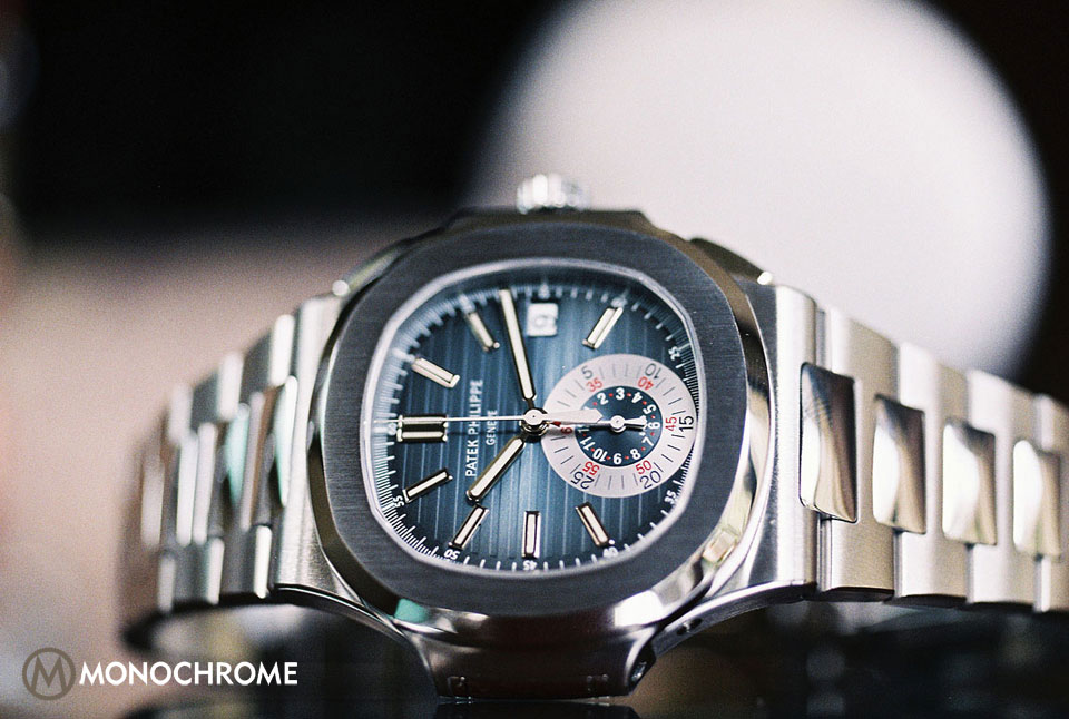
Evidently, the 5980 is the same classic Nautilus we all love with the simple addition of a chronograph function. Unlike most manufacturers who use the triple sub-dial approach to allow reading of both actual time and stop watch elapse time, the 5980 Nautilus went with a slightly more minimalistic approach through the usage of a single (but larger) sub-dial visible above the 6 o’clock marker.This sub-dial is also a co-axial chrono counter, which allows the wearer to keep track of both minute (note that it’s a 30 minute counter) and hour without the need for any additional sub-dial. This also allows the piece to maintain the cleaner and more symmetrical look that we came to identify with the original Nautilus.
Flip the piece over and you get a glimpse of its magnificent in-house movement, with its see-through sapphire crystal case back. This might look odd at first, but you might be forgetting that the movement in the 5980 was one of the company’s high points in releasing this sporting legend (more on the movement later). It would be a shame if it didn’t have an exhibition case back, and besides, for a company to unveil its newly built automatic chronograph, it’s only natural to do so.

Dial / Hands
With one look at the dial, immediately you’ll notice the gradation from dark blue in the middle to black at the periphery (at least for the blue version). This is certainly a distinct look that was practically carried over from the original Nautilus line. It also has a horizontal embossed pattern that creates this three dimensional effect in lieu of the patisserie that we find in another iconic luxury sports piece. There are nine instead of twelve index markers in white gold and covered with luminous coating. This leaves space for the large co-axial chronograph subdial to fit right above the 6 o’clock marker. There is also the date aperture at the 3 o’clock similar to the original Nautilus. The dial in itself is in every way as exquisite as it can be, everything from the gradated color scheme, to the baton hour markers are designed to make a watch connoisseur’s heart swoon. It is in essence, the very face of the piece, and one that is to be gazed upon by its wearer for years to come.

Now we cannot talk about the dial, without talking about the hands, can we? The hour and minute hand, similar to the markers, are in white gold and covered with luminous coating. Again, these are in the baton style, designed for consistency; however, the steel seconds or chronograph hand do not share the same treatment. It might be a bit of a downer to some, but again it all boils down to consistency. If you look to the subdial, the hour-counter and minute-counter are both sandblasted similar to the chronograph hand, but this time in rhodium-treated brass, and with a red lacquered tip to the minute-counter for differentiation.
Reading the time in this piece, both the actual time, and the stopwatch elapse time, is very easy. It does take a bit of getting used to the 30-minute chrono-counter in the subdial, but other than that, everything else pops-up in a swift glance. Perhaps the only caveat here is that one must understand that there is no dedicated seconds hand in this piece. If you’re eager to know if the watch is running or not, you might need to wait a minute or two to find out, or you can simply start the chronograph.

Case / Bracelet
The design of the case or even the built-factor requires no introduction. The iconic semi-octagonal or semi-circular or whatever tickles your fancy has always been part of the Nautilus identity. Its transition away from the standard circular dial of most Pateks, is what made it one of the most revolutionary timepieces ever created. It is of course molded together with a satin-finished H-link bracelet with polished central links. The newer Nautilus however is composed of a three-piece case design (back, caseband, bezel), relatively different from the original two-piece case design. Although, I am no engineer, I am drawn to assume that a three-piece case design is much easier to produce than a two-piece one. This again, has always been pondered upon by vintage Patek collectors, such that pricing of the original has always been much higher than the 2006 versions.
Now going back to the watch at hand, the 5980 is perhaps the biggest and also thickest Nautilus to date. This is of course due to the chronograph movement and making the chronograph pushers.

The case diameter measures 44mm (including the ‘ears’), which is actually just 2mm larger than the ref. 5711. While the ref. 5980 measures 12.6mm in height, it feels more hefty and thicker than all other Nautilus models. We must keep in mind though, that the Nautilus has always been praised for its thin case, so the 5980 is a different story altogether. However in my experience, the thicker case is complemented by its slightly larger case diameter: in general it wears a bit bigger, but never did it feel like those oversize pieces we see in the market today. It just sits there comfortably, ticking the time away, and if ever it even could become an annoyance, a quick glance would easily release the tension and put a smile on one’s face.

The bracelet on the other hand, in my opinion, is perhaps the weakest link of the piece (pun intended.) The mirror polish of the central links would be fantastic to look at when the piece is safely kept away for occasional winding. But for a “wearer” like me, it attracts finger prints like crazy. This would also mean that it may be prone to scratches as well. Although polishing could easily solve this issue for long-term use, in the eyes of collectors, this still constitutes metal loss that could diminish its value. The biggest downer however is the stainless steel fold-over clasp, the clasp is very stiff. For a minute there, I thought I was delusional, that I was simply refusing to remove the piece from my wrist; but after a few tries, and with a bit of force, it popped open. I feel that for a timepiece of this magnitude, the clasp should have been given more thought. Perhaps they could learn a thing or two from the steel smiths at Rolex.
Movement
Whatever it lacks in the bracelet, by the grace of the horological gods, the Nautilus made up for it with the introduction of a new chronograph movement. Inside the 5980 is a movement fully crafted in-house by Patek: the new Caliber CH 28-520 which sports a giant 21k gold central rotor that winds the movement, a Breguet balance spring, and a four-arm Gyromax balance that beats at 28,800 oscillations per hour. The chronograph functions just the way it was intended to, start stop at 2 o’clock, and hand reset and flyback at 4. The date however requires a bit of a push pin for rapid correction, not exactly a big deal, but perhaps something to improve on. It is nonetheless one of the most refined and sophisticated sports chronographs on the market.

Wrap-up
The Nautilus 5980 or as I prefer to call it now, the Jumbo Chronograph, is by and large, one of the best sports chronographs… wait, scratch that… one of the best sports pieces I ever saw to date. It just hits the sweet spot in every way possible. Although it had some down points like its stiff bracelet and chronograph hands, it did make up for it in heritage, case design, and movement finishing. It’s not exactly THE perfect piece (writer’s nitpicking disclaimer), but given the choice of this, over the 5711 or the 5712 or even its biggest competition, I believe I know which one to pick. The world of sports chronographs is a crazy one partly because of its connection to motor racing, where we find the McQueens, the Sifferts, or the Newmans of old. In contrast to these icons, the Jumbo Chronograph is still in its infancy. But then again, it’s a piece that requires no racing icon as it can stand on its own, and to this date it remains so. Even if the Jumbo Chronograph were to be (God forbid) discontinued, in its last days, as with Senna, I trust it’ll gladly move over and pave the way for the newer generations.
Stuff of legends…? You be the judge!
The Nautilus line also made a white dial version last year, the 5980 included (check here). Click here to visit the Patek Philippe website (click here) for more details.


6 responses
Exquisite timepiece and a brilliant write up about it.
Thank you Anders, much appreciated.
“Even if the Jumbo Chronograph were to be (God forbid) discontinued”
They just did 🙂
Excellent write up on the 5980! Well done!
Wesley – I must’ve jinxed it, didn’t saw that coming!
Haresh – Thank you!
PP Nautilus
Monochrome watches 5980/1A chronograph review
Nice review.
However, it is very much ‘to each his own.’ No one can deny what appeals to each watch lover. However if this piece did not have ‘Patel Philippe’ then this watch would be considered an also-ran whether you consider the design, or the movement. It is definitely NOT Senna material that’s for sure!!!
Why?
Let’s look at this objectively:
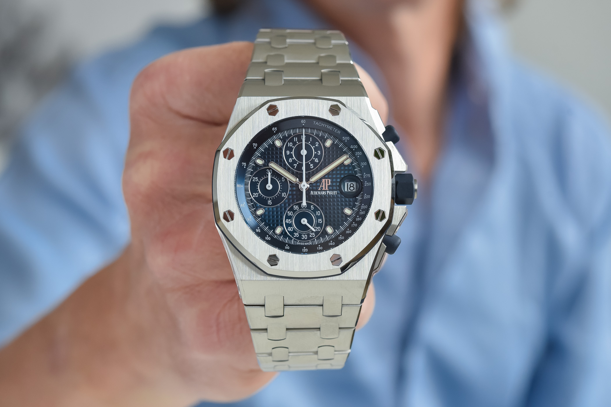
1. Yes, the design was by Gerald Genta, how interesting! It was conceived to compete with the AP Royal Oak. The RO is the original steel sports watch with the price tag to match the gold watches and was the piece that turned the watch world upside down. Everyone laughed, but AP got the last laugh. That was in 1972. PP could have done better than to ask the guy who designed the Royal Oak to design the competitor… and the Nautilus is a derivative design. The bezel is a smoothed octagon…hmmm where did that idea come from? The RO has an octagonal bezel…
So did the Nautilus achieve what was stated above? Obviously not. If it had another brand on the dial it would have been dismissed outright.
2. The case. The original Nautilus has a 2 part case. Guess what the Royal Oak case design was? You guessed it. 2-part. So much for the marketing hype about the Nautilus in nature inspiring the 2- part case. Copy-cat design and carryover from Genta.
Nowadays as in this example, the design is flawed with the 3-part case to show off the movement. AP does this too which is why the originals are worth more.
3. The case of this is ridiculous, with the chrono pushers ruining the design. If they were serious about maintaining the purity of the case design PP would place the chrono pushers on the left a la the travel time does now. That would be a stroke of originality.
4. The dial. Texturing is a variation on the Royal Oak. Another copycat design carryover from Genta, just a little variation on a theme. No doubt it is beautiful but certainly not original.
The dial of the chrono: ugly as sin, and totally incongruous with the rest of the dial. A flat disc on a textured dial. Puhleese…An aftermarket accessory like a boy racer spoiler added to the boot of a car. Yuk.
5. The movement. A tick for in house caliber for sure. A tick for great finishing and workmanship for sure. But a great movement? You must be kidding. Now let’s imagine the same movement finished to say, a workman-like Rolex standard- steel rotor, no fancy polishing. Would it still be a great movement? A separate pusher for the date mechanism? What???? Imagine the scorn that would be poured on Rolex/IWC/Omega et al if they did something like this, omigod…
6. The bracelet. An afterthought at best. A sport watch with polished links is silly. But ok for those whose sport is to think about sport, not participate in sport.
The tapering links. Another copycat design from the mind of Gerald Genta (no pun intended, but lifted from his marketing material). Clever, and adds to the cost, but not original. Also makes the ‘sports watch’ feels anything but sporty, it feels flimsy.
The clasp. Cheap and nasty, no thought given to ergonomics. It would have messed up many a well-manicured nail in sure (well of course since they were so expensive only the well-heeled could afford these, and things should be considered a unique characteristic of the watch and not a flaw…)
Well, just my two cents.
I have a Royal Oak, as it’s ‘the original’. While it is iconic, it too is not without flaws both in design and practicality.
The Nautilus is a beautiful watch, but strip away the PP name and quality of finishing , and it really is just an also-ran. It should be admired for what it is, but not for what people romantically try to associate it with. It definitely is NOT original, it definitely is NOT clever, and definitely is NOT iconic.