The Seiko Prospex Diver’s 1965 and 1970 Re-Imagined With Vintage-Style Fabric Straps
The look of yesterday, the specifactions of modern watches.
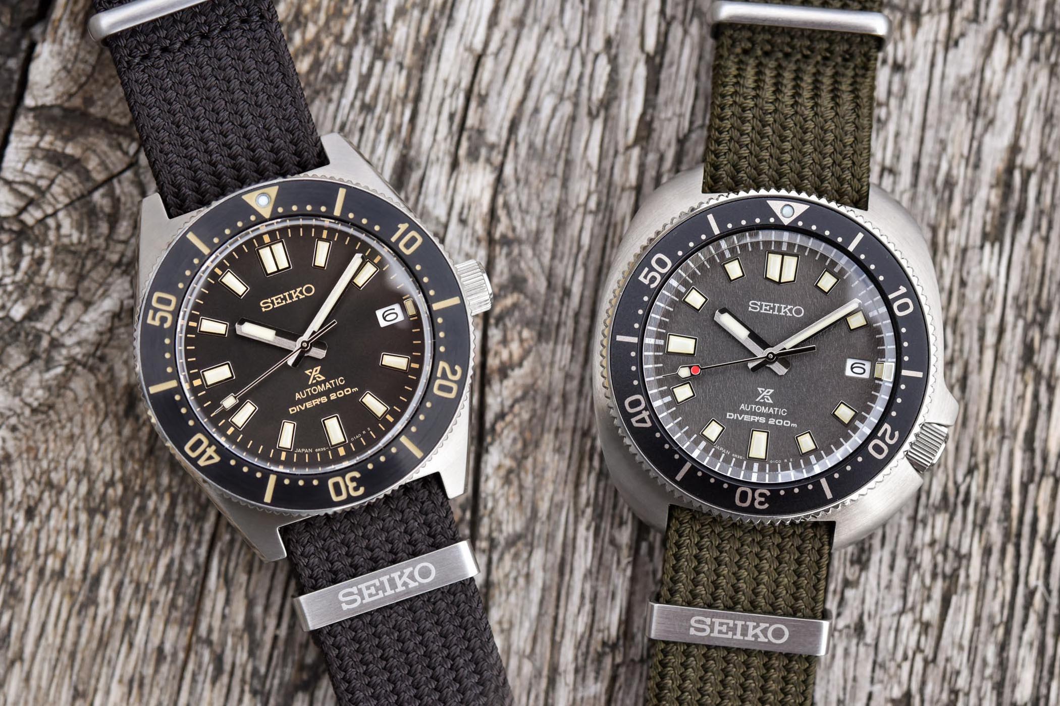
Since the introduction of its first diver’s watch in 1965, Seiko’s reputation for manufacturing robust, performing and technically advanced aquatic models is simply undeniable. The brand has forged its notoriety around innovation and the modern Prospex line of models reflects this. Until recently though, the performance of Seiko’s diver’s watches prevailed over design. With its latest models, however, Seiko has brought quite a dosage of vintage charm in its collection, resurrecting in a faithful or modernized way some of its glorious models. Today, the brand introduces two new models that fall perfectly in the second category, with new fabric straps and warm colours to enhance their retro style. Let’s have a look at the new 2021 Seiko Prospex Divers 1965 and 1970 Re-interpretation, known as the references SPB239J1 and SPB237J1.
What we have here today is pretty simple, yet also rather attractive. Two watches, two concepts that are already known and appreciated, both from the SPBxxx range, but revamped with new colours and the addition of newly developed straps. On one side we have a new take on the classic 62MAS-inspired watch, a modernized and relatively compact version that is based on the design of Seiko’s first watch, the 1965 diver. On the other hand, we have a new edition of the Captain Willard, the watch that takes on the design of the timepiece worn by Sheen in Apocalypse Now, the Seiko 6105-8110 that also proved its robustness on the wrist of explorer Naomi Uemura.
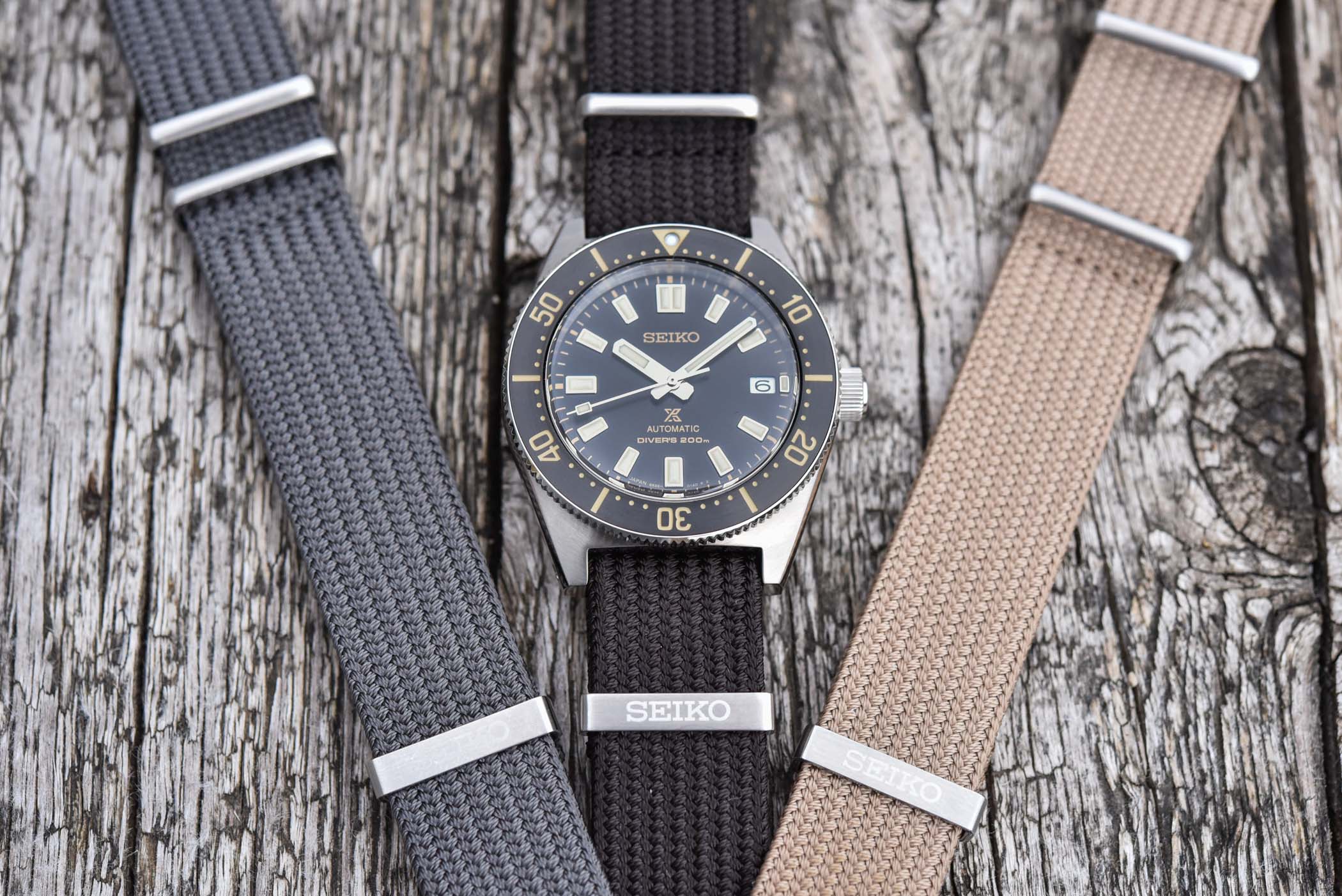
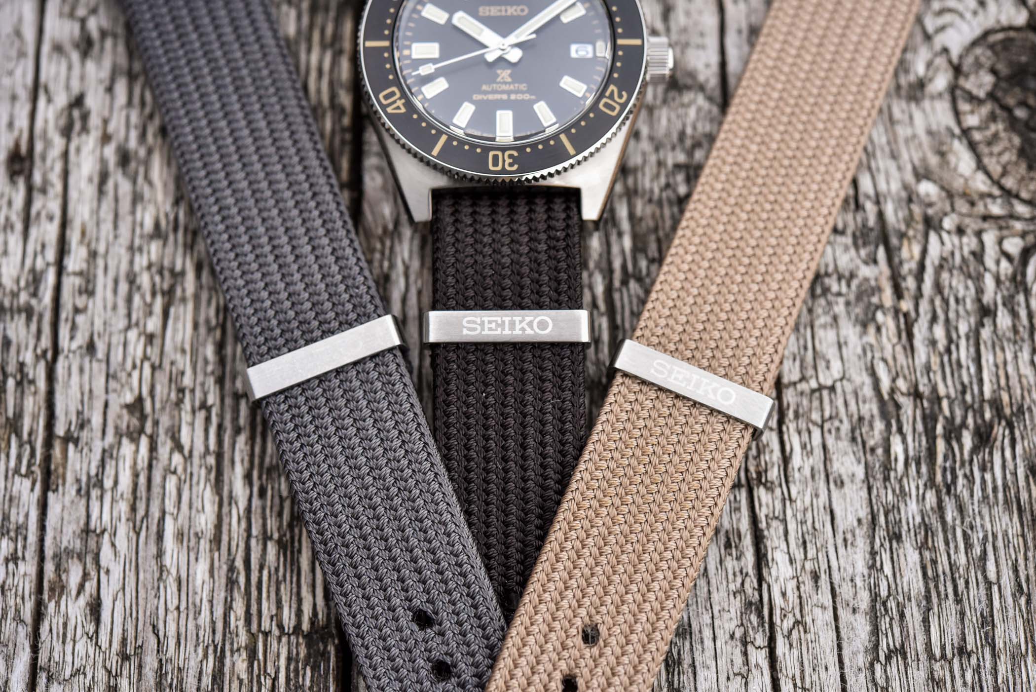
But in addition to these new colours and dials on existing watches, Seiko is mostly using these two novelties to launch its new fabric straps. Big news…? Well, these might just be straps, but they are actually rather cool and very well executed. Capitalizing on the Japanese craftsmanship that the brand is proud to use in most of its collection, these straps are made using a traditional braiding technique named Seichu. These NATO-inspired nylon straps are far from the cheap straps you’ll find on the web and are crafted with great attention to details and comfort. These are indeed made in the same way as “obijime,” the decorative cord that holds a Kimono sash in its place.
According to Seiko, these “straps present a uniquely Japanese aesthetic and texture and are specially manufactured to have a tensile strength nearly four times that of regular Seiko fabric straps.” They are also highly resistant to degradation caused by exposure to sunlight or salty waters, thus meeting the demanding standards of Prospex. That’s on paper, but in the flesh, these are thick, visually satisfying straps with far more suppleness than you’d expect from a fabric strap of this thickness. They are also soft to the touch and really feel like a proper piece of OEM material, not like an aftermarket addition to the watch.
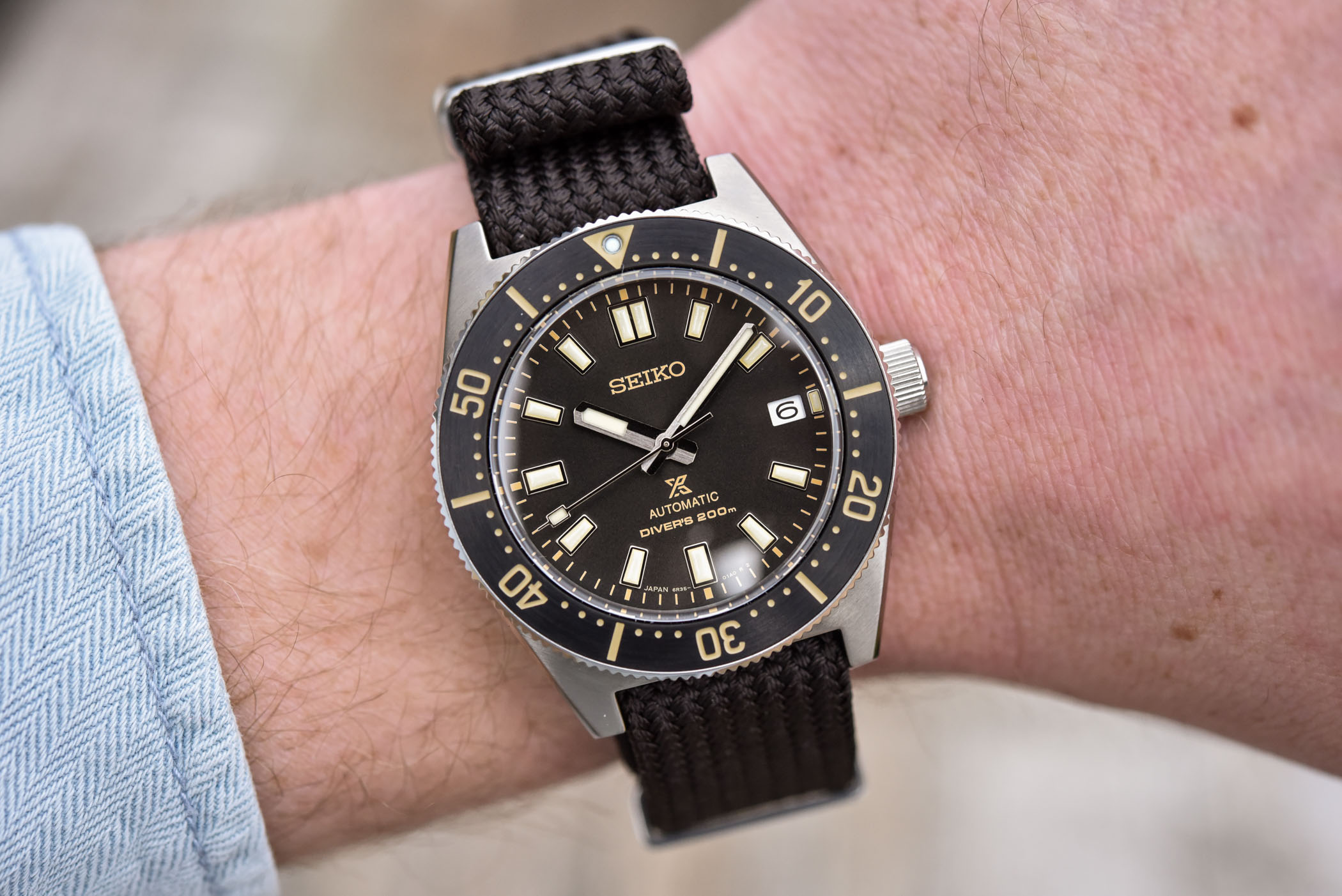
The Seiko Prospex 1965 Diver’s Modern Re-interpretation SPB239J1
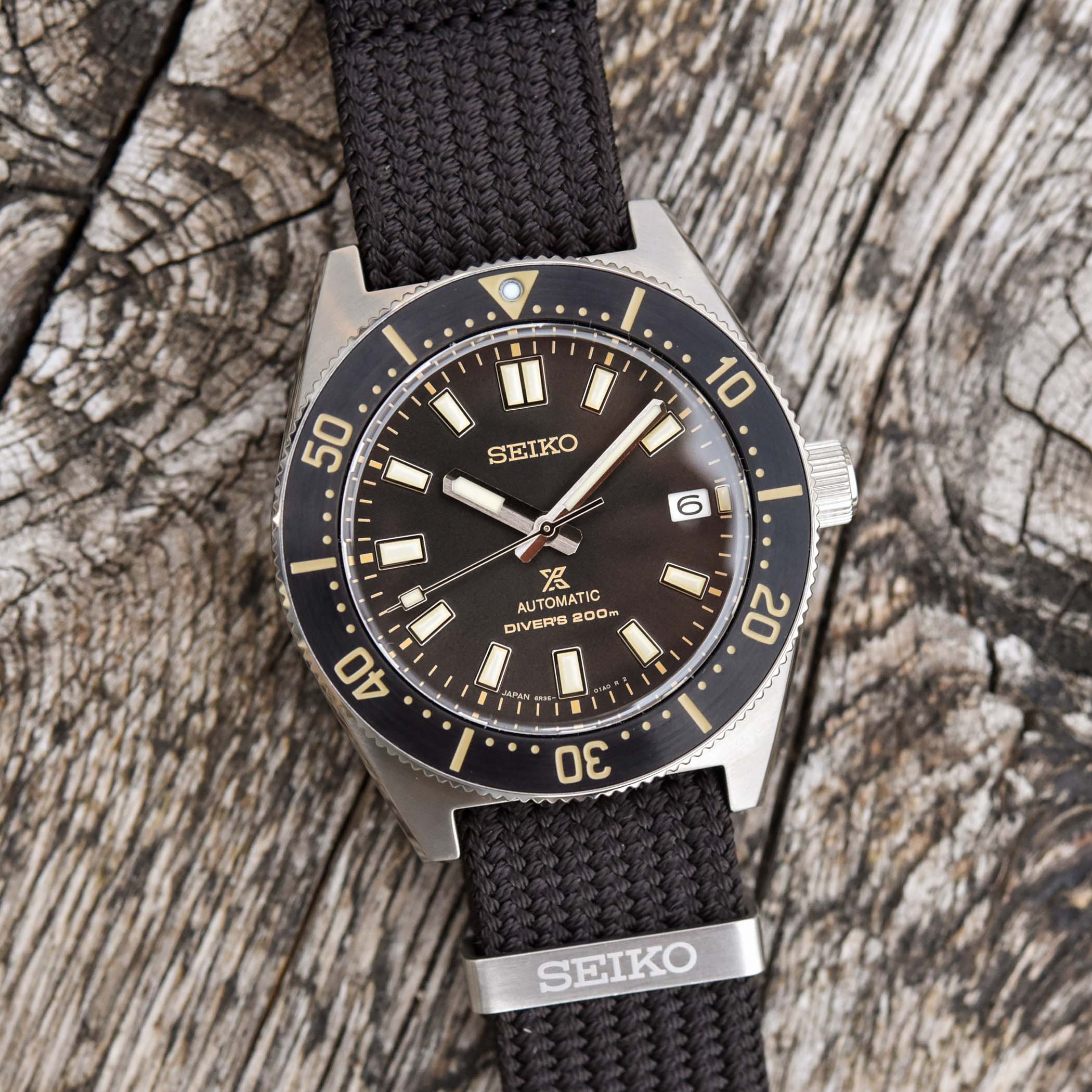
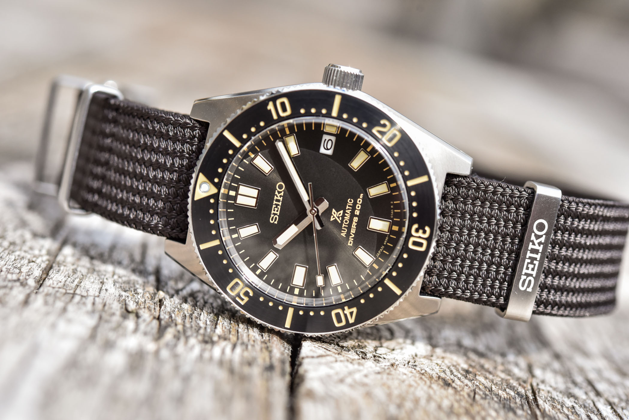
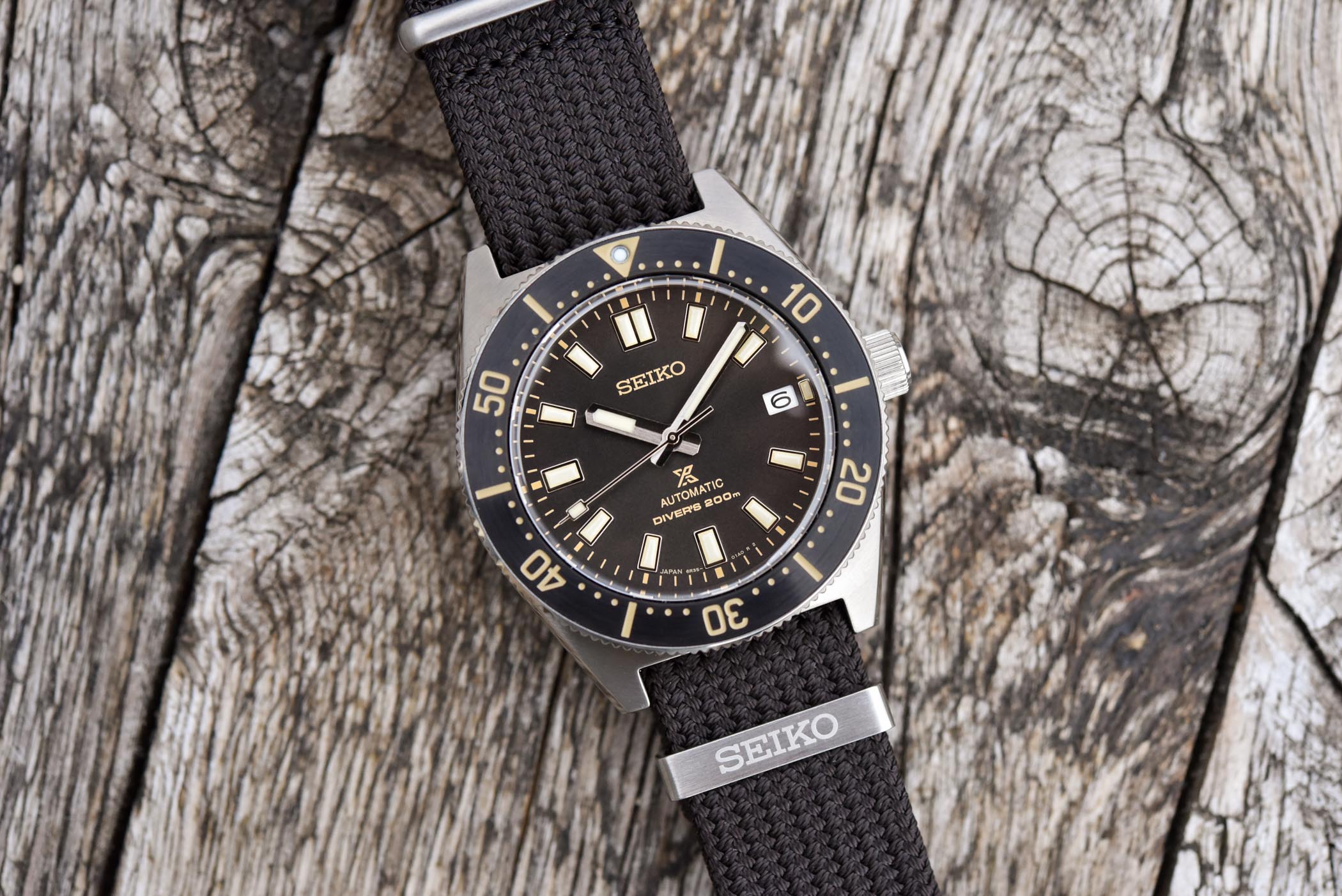
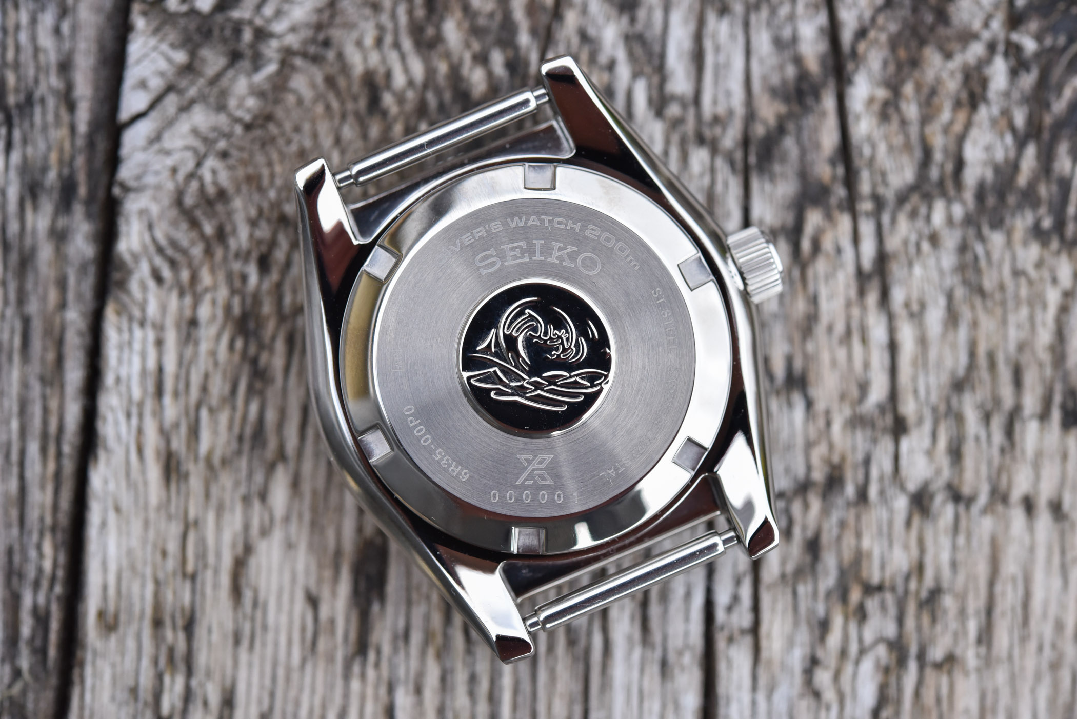
To launch this new series of straps, Seiko is introducing two new watches, including first a new colour scheme for its re-imagined 62MAS. This watch remains identical in most aspects to the SPB143, SPB147 and SPB149 we reviewed here. This means a compact case of 40.5mm in diameter and 47.6mm lug-to-lug. The shape is reminiscent of the Seiko’s first-ever diver’s watch, with sharp integrated lugs, a polished bevel running all along the side and an unprotected oversized crown. It has been modernized though, with a wide bezel and a domed sapphire crystal on top. Featuring a screw-down crown and caseback, it is water-resistant to 200m.
What’s new for this SPB239J1 is the colour scheme. In order to emphasize the retro look, Seiko is giving this edition a sunray-brushed dark brown dial and applied indexes and hands that are silver-coloured, and filled with a generous amount of radium-toned Lumibrite material. The same colour scheme is found on the circular brushed metallic insert of the bezel, with the graduations executed in beige. The look is warm, vintagey and rather attractive – at least if you’re into retro watches.
These warm, earthy colours are paired with a pair of straps – indeed, two straps are included in the presentation box. One of these Seichu straps is dark brown, matching the dial and bezel. The other one is beige, matching the luminescent material. No-fault here, both are greatly pairing with the watch. At the heart of this model is a well-known calibre from Seiko’s mid-range, the calibre 6R35 with its 3Hz frequency and a solid 70h power reserve.
The Seiko Prospex 1965 Diver’s Modern Re-interpretation SPB239J1 will be available in the permanent collection from June 2021, at a price of EUR 1,250.
The Seiko Prospex 1970 Diver’s Modern Re-interpretation SPB237J1
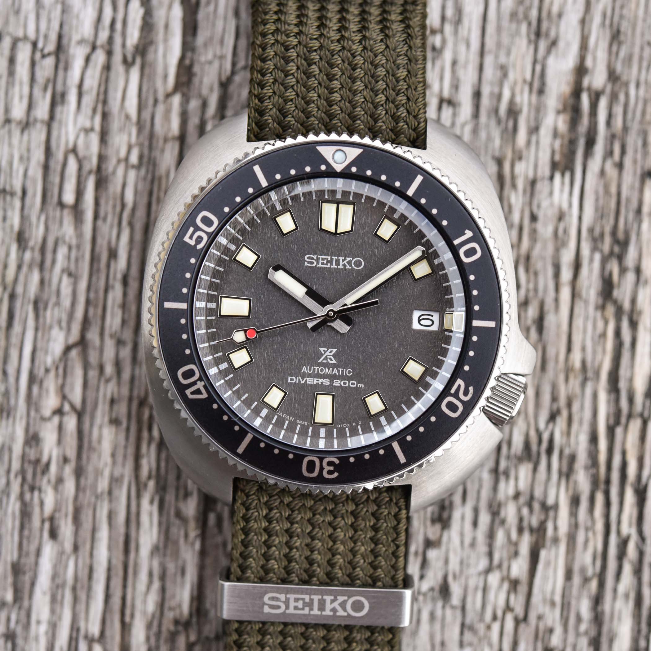
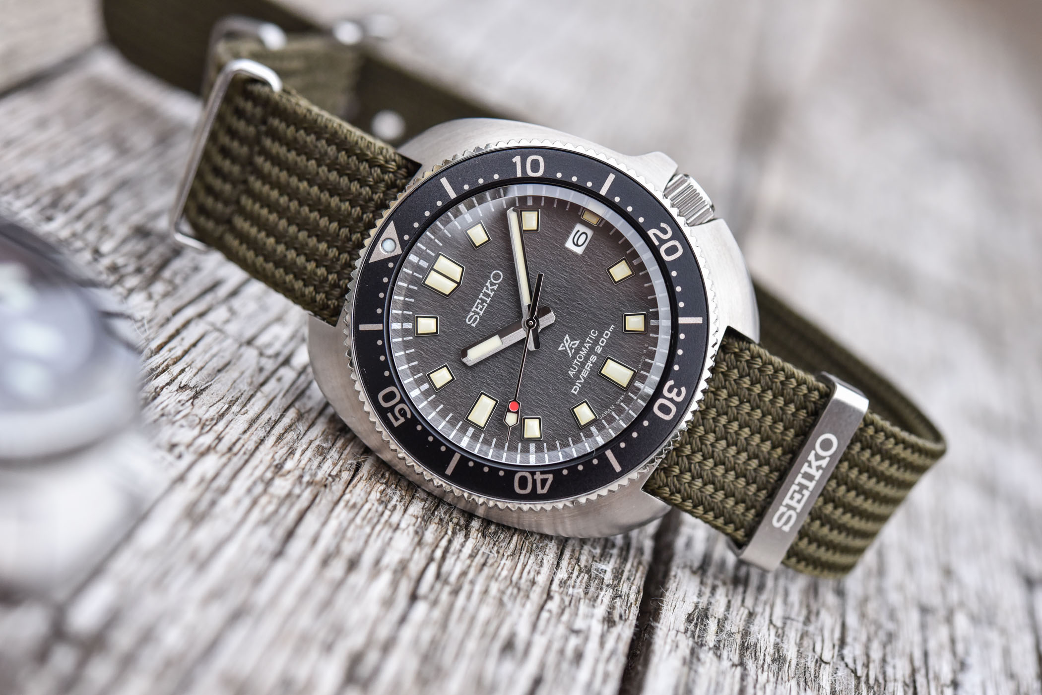
Second in line to present these new straps is a new take on the classic 1970 Turtle watch, a watch that has earned the nickname “Captain Willard” as it is directly inspired by the watch worn in the legendary movie Apocalypse Now. It the direct descendant of the Seiko 6105-8110, an accessible, readily available and sturdy dive watch popularized by American soldiers stationed in Vietnam, but also a watch that has accomplished multiple milestones on the wrist of explorer Naomi Uemura.
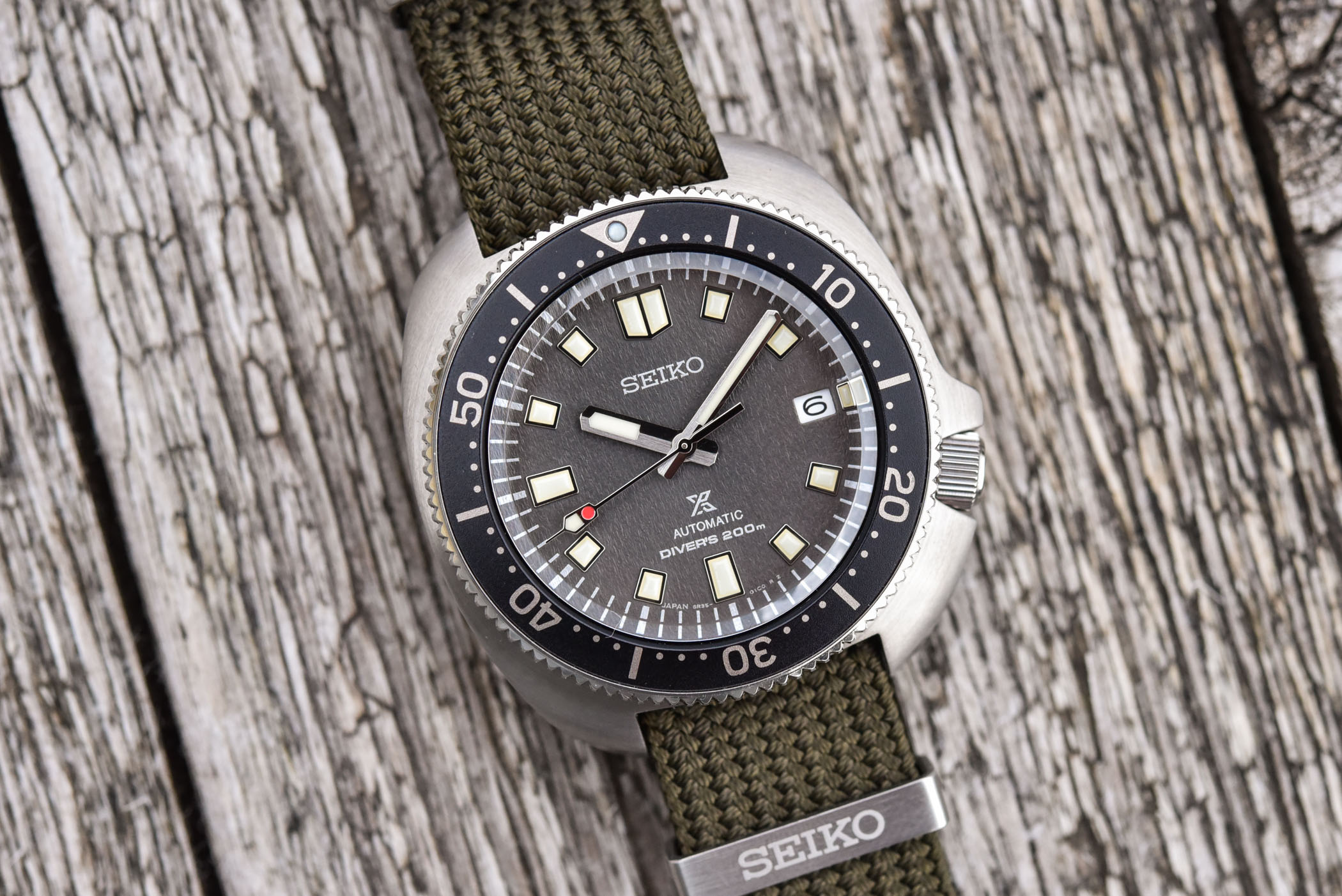
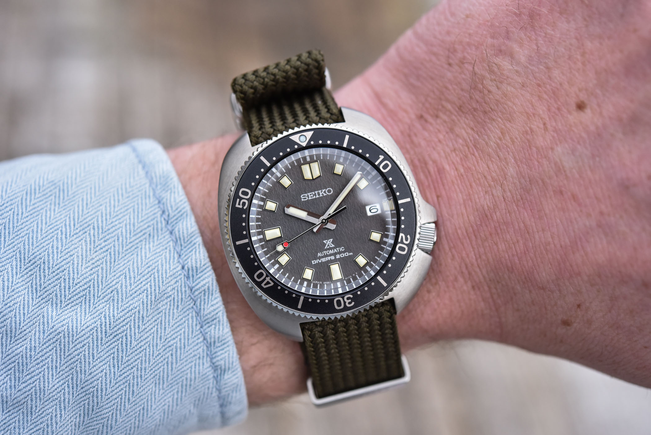
This watch, already existing in various editions, including these green and black versions, has the typical turtle-shaped case and the crown positioned at 4 o’clock. Once again, we’re talking about a relatively compact watch regarding Seiko’s standards, with a 42.7mm diameter but only 46.6mm lug-to-lug. The stainless steel case, water-resistant to 200m thanks to a screw-down crown and caseback, is topped by a nicely bevelled sapphire crystal and a unidirectional bezel.
New to the model is the dial. The SPB237J1 is indeed equipped with a textured background and a nice faded grey colour. Once again, with vintage spirit in mind, the silver-coloured hands and applied indexes are filled with beige-coloured Lumibrite, giving this watch a patinated look that greatly matches the phantom-like colour of the dial. The bezel insert is here matte grained with, once again, a fully-graduated 60-minute track executed in beige. The result is a bit more technical than the 62MAS-inspired watch, and goes well with the military past of this watch.
To match these new colours, Seiko gives the SPB237J1 two fabric straps. One is done in classic olive green and the other one is matching the colour of the dial, in mid-grey. Here again, we find the in-house calibre 6R35 with 3Hz frequency and 70h power reserve.
The Seiko Prospex 1970 Diver’s Modern Re-interpretation SPB237J1 will be available in the permanent collection from July 2021, at a price of EUR 1,350.
For more details, please visit www.seikowatches.com.


7 responses
Will the straps be available separately?
Dive watches are like the SUVs everybody wants, while I prefer sedans. I feel like I’m from another planet because I like watches without a rotating minute bezel. Dive watches are sooo played for me. No thanks.
Disaster! +1200€ and not even alligned in the photos (?!); bezel is off, then dial marker (at 12) and chapter ring is also off – bad printing or missalignemnt issue again and again … I love Seiko, but I would never spend +1000 for a watch with quality control issue like this. Seiko, do you read comments??? 🙁
I really like the color way of the SPB237. However, the addition of the lume plot to the right of the date window lands right on the minute track and ruins the symmetry of the dial. The SPB151 didn’t have this extra lume plot and looks so much better.
I love this old design by Seiko, but it really is a disaster for a watch in that price bracket to have alignment problems. Another issue of these watches is where the bracelet attaches the case. This has been eliminated here (not solved) by using a strap.
I have to agree with Marty there are definitely some alignment issues. I’ve got a seiko 5 SRPD65k1 and it has the same issue but my seiko was a 1/6 of the price so you can expect slight discrepancies. At that price they need to do better
I’m so tired about all these silly messages about Seiko’s alignment issues by people who don’t own a Seiko… In the top picture, which I guess it’s the one people is referring too when talking about ‘alignment issues’ it’s crystal clear that the bezel is not set to 12:00… that doesn’t mean that the bezel is not aligned but rather that the photographer didn’t noticed it when taking the picture and took it with a bezel set at point 1 of 120 possible adjustment bezel points (instead of taking it at 120 of 120 where it would have been perfectly aligned). Blame the photographer, NOT SEIKO.